Out with the old, in with the new logo for the UNC System.
“It’s a logo, a brand, an effort that really elevates the platform – the unified platform – that is the University of North Carolina System,” system president Margaret Spellings said at a press conference unveiling the new logo Wednesday morning.
“North Carolinians loves this university,” Spellings said. “They love the university in their community, but they also appreciate the power and the mighty engine that is the University of North Carolina System.”
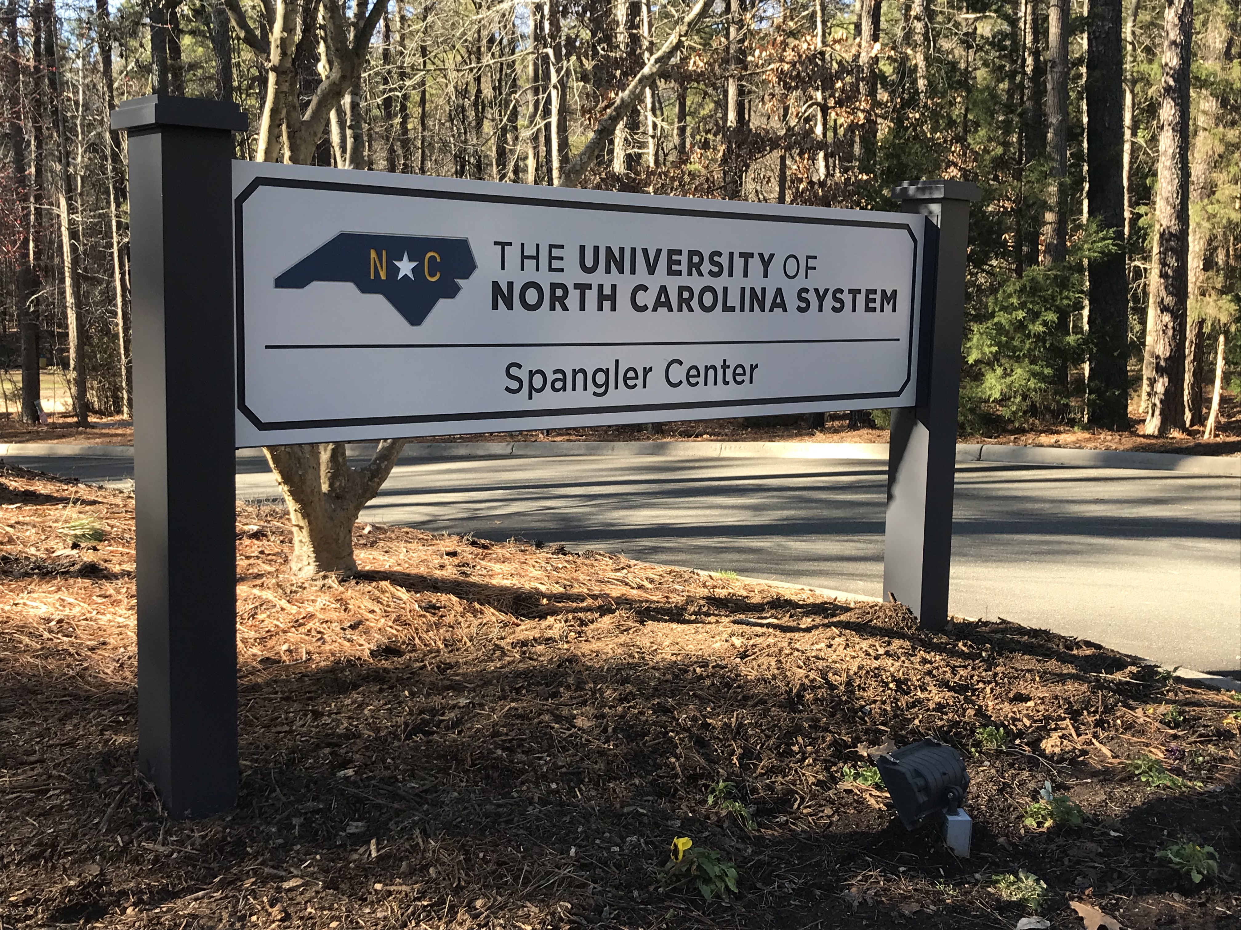
Sign outside UNC System offices in Chapel Hill. Photo via Blake Hodge.
Spellings said this rebranding project was important to detail the important work being done across the UNC System and to attempt to avoid confusion between the system and its flagship university in Chapel Hill.
Part of that rebrand is moving away from referring to system offices, located on Raleigh Road in Chapel Hill, as UNC General Administration.
“General Administration, which means nothing to no one, is gone,” Spellings said. “And I think that’s important too, to call ourselves what we are.”
The move will now be toward making a more intentional reference to the system rather than just the letters UNC. If there are any slip-ups at the system offices, they will come at a cost.
“We have a little bit of an ‘oops jar’ that is for the staff that we are challenging ourselves not to use those words anymore,” Spellings said of the phrase general administration.
Spellings noted that the system had evolved greatly since expanding to 16 university campuses in the early 1970s.
“From 1971 to now, enrollment has tripled,” Spellings said. “We’re in a day and time when 70 percent of the jobs require post-secondary education.”
Spellings added, “We are a big part of the success and prosperity of North Carolina and why we’re a growing and thriving state.”
In a broader sense, Spellings said it was important for the system to communicate its message and its mission to North Carolinians across the Tar Heel state.
“How we need to do something we’ve never done before in American higher education,” Spellings said, “and that is educate darn near everybody to much higher levels in very affordable ways.”
The new logo and rebranding effort comes at a cost of approximately $250,000 and has been in the works since last April.
The new logo is an outline of North Carolina using 17 sides, which Spellings said was intended to be a reference to the 17 campuses in the system. The blue filling in the North Carolina outline of the new logo is the same blue that is used in the state flag, Spellings said.
You can see the video from the UNC System accompanying the launch of the new logo below:


